1510 Tutorial-Final crit
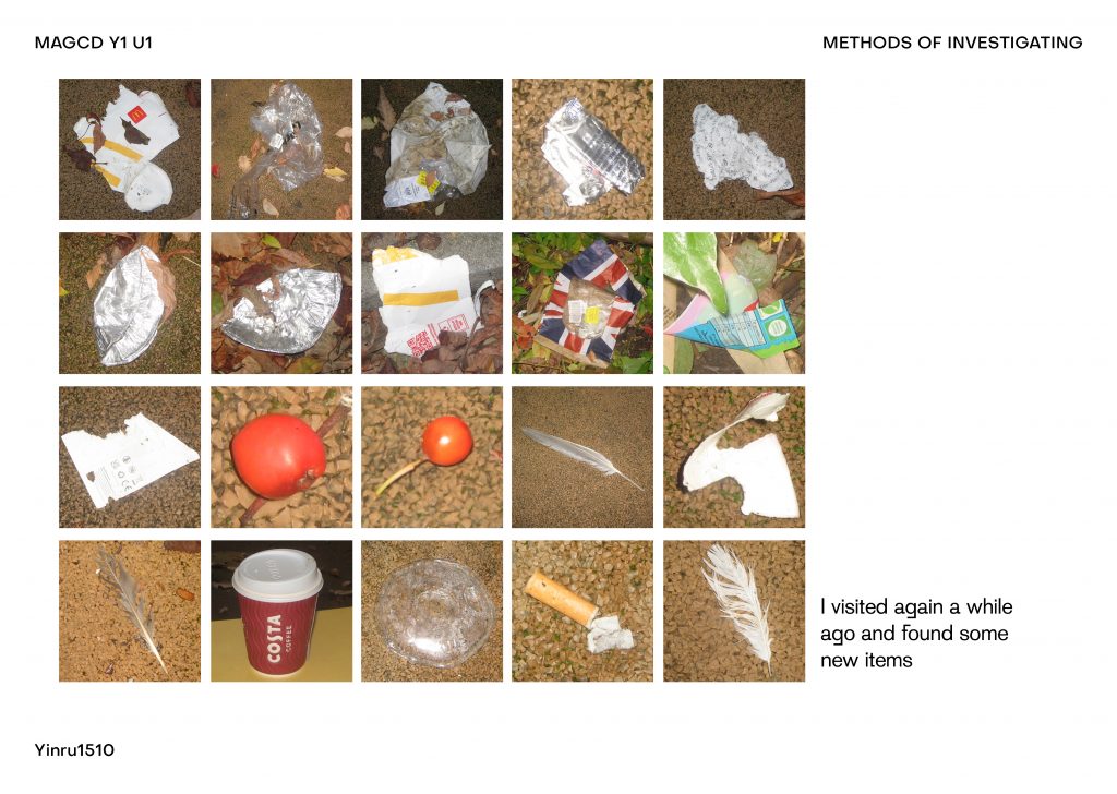
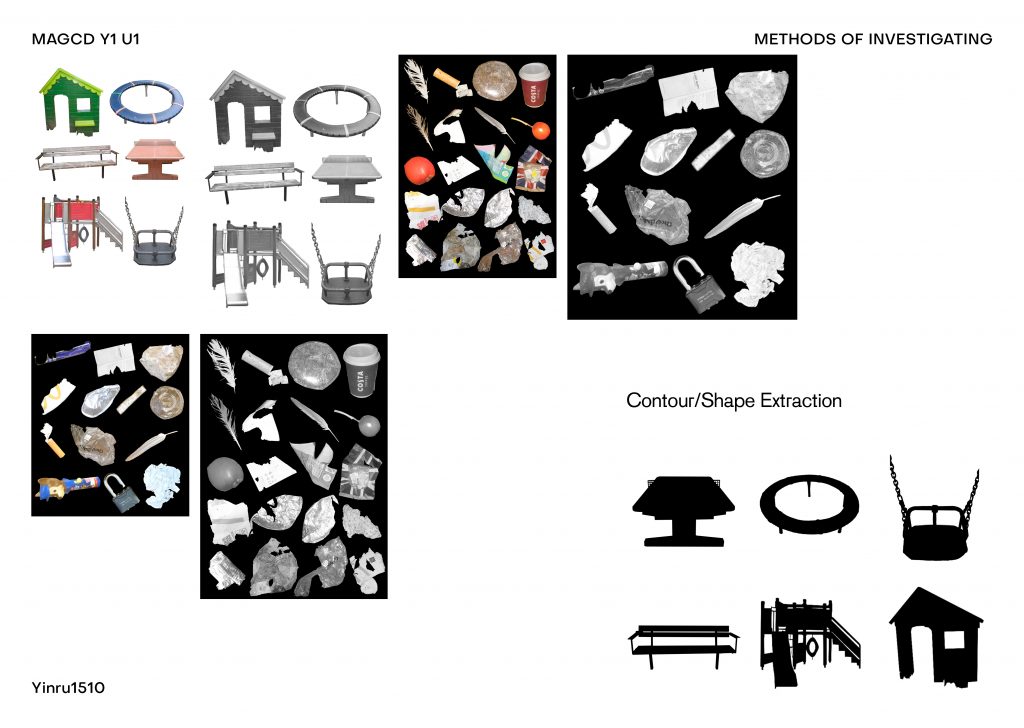
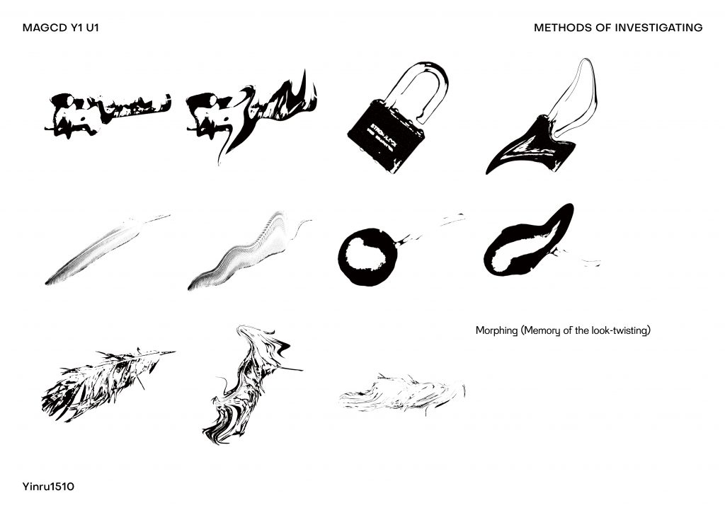
This week I’ve been gradually visualising objects or images I’ve collected. Extracted some shapes, added some ‘texture’. I think I should shift my focus from ‘nostalgia’ to ‘memory’.
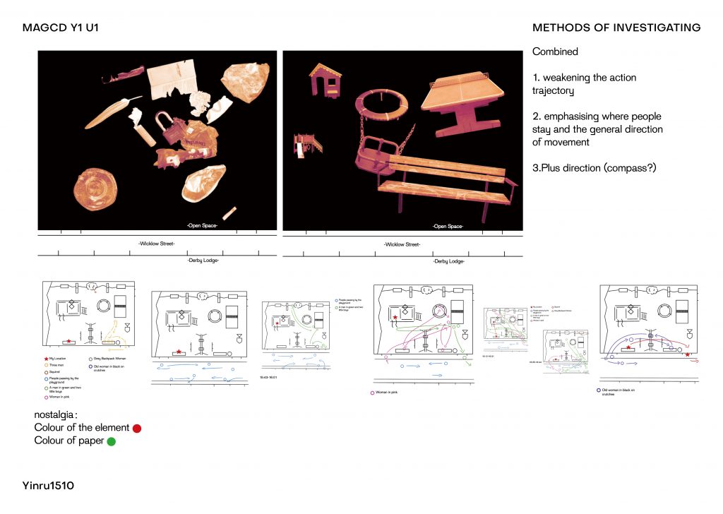
Some progress and ideas
The final idea is to make a map (which can also be used as a poster, I guess) – diagrams type.
The typeface used in My map:
Grotzec
‘Grotzec Condensed was originally designed for the Surf Portugal magazine while Feliciano was the magazine’s art director.
Details such as different curve speeds in the exterior and interior of the letter shapes give the typeface a subtle humanistic touch.’
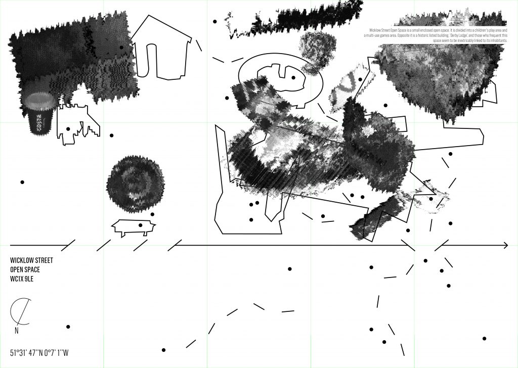
- The dot means location of human temporary stay.
- The dotted line means human movement trajectories.(front)
- The black image in the background means suspected items left behind (not items that should be in the bin).
- The dotted line means areas of high prevalence of human trace retention.(back)
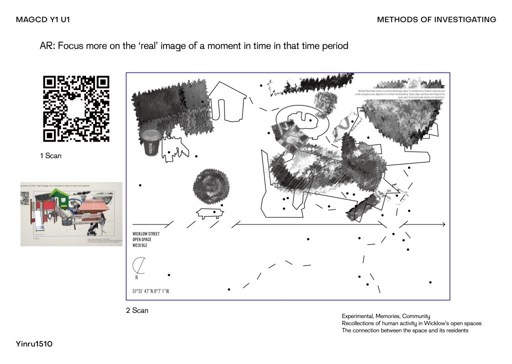
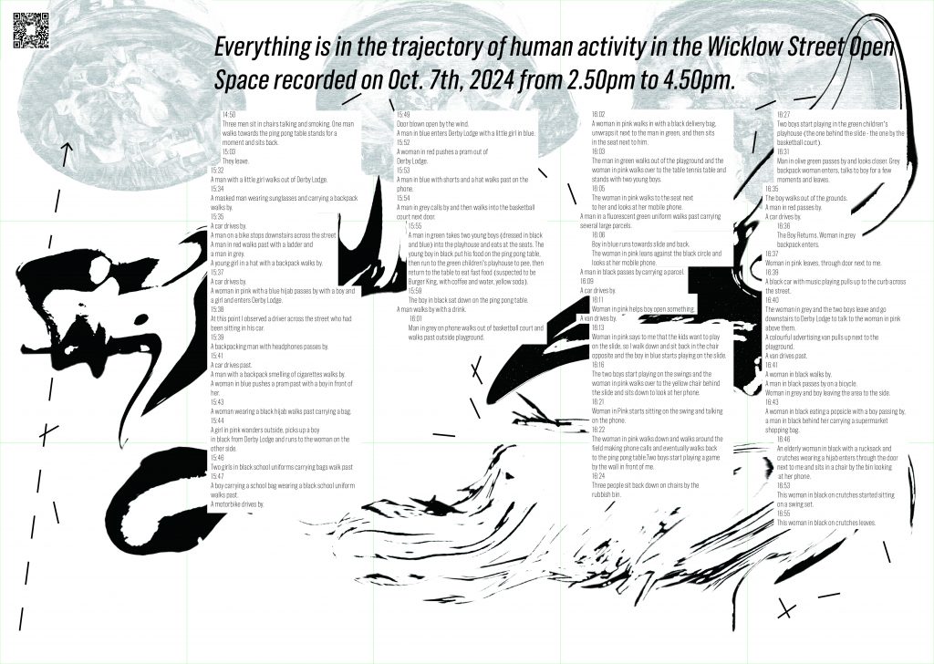
AR image attempt
The idea at the time was that it was unclear, jittery, distorted, black and white because of the ‘memory’. But if you want to view a good memory of a moment in time, then scan the QR code to see the clear, colourful image displayed on the AR.
The idea was to print the black and white image on textured or coloured paper, but there didn’t seem to be time to do that. So it didn’t convey the ‘old’ ‘memory’ kind of feeling…˃̣̣̥᷄⌓˂̣̣̥᷅
Leave a Reply